

Webone Dashboard
Introduction of Hi-Fi Prototyping of the App
This dashboard is developed by WebOne Company
Project duration: 4 months
Design team members:
- Behnam Shabrandi, Product Manager
- Fatemeh Parpanji, UI/UX Designer
- Niloufar Arefnia, Scrum Master and Sales Manager
- Moein Mortazavi, Computer Engineer (Consultant for coding limitations)
Introduction
A new dashboard has been created for a web design company to meet the needs of various users while providing significant improvements in the appearance and functionality of the old dashboard. This dashboard is designed to maintain existing capabilities and features while offering a smoother and simpler user experience for customers. Based on feedback from users, the current dashboard was outdated and overly complex, necessitating an update and changes to make it easier to use for different types of businesses, especially small enterprises.
Dashboard Design Goals
Improving Visual Design: The primary objective is to present a modern, attractive, and minimal appearance that conveys a sense of freshness and professionalism to users.
Ease of Use: The design should allow users, particularly those working with smaller websites, to interact with the dashboard effortlessly and utilize its features without confusion.
Better Information Organization: The goal of enhancing the information architecture is to make access to important data quicker and easier, with logical and user-friendly categorizations.
Reducing Clutter and Complexity: Unnecessary features and options for smaller users should be minimized to create a cleaner user interface, allowing for greater focus on practical features.
Increasing Flexibility: The dashboard should be designed to allow customization for users, enabling them to enable or disable the features and tools they need.
Enhancing Efficiency: Management processes, such as handling products and categories, should be simplified and expedited, ensuring users do not encounter difficulties when making changes.
Improving User Experience: The design should enable users to work with the dashboard easily, without the need for special training, with all tools and features presented in a logical and accessible manner.
Optimization for Different Devices: The dashboard must be fully optimized for use on both mobile and desktop devices to ensure a consistent and satisfying user experience across all environments.
Research Method
In this section, we conducted a phone interview with 5 current customers of Web One to research and understand user needs in coordination with the sales and support departments. For this purpose, we first defined the interview questions and target user characteristics based on the dashboard design goals. Finally, after the interviews and analyzing the responses, we arrived at the following personas.
User Persona
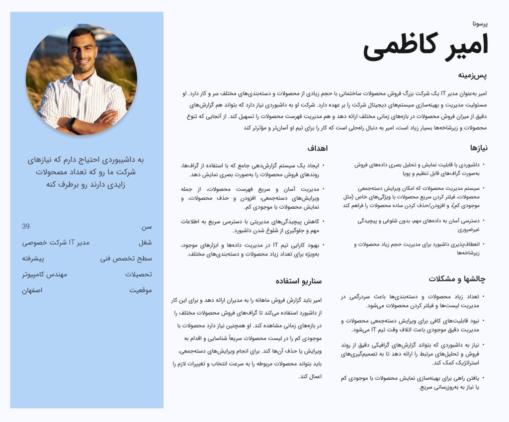
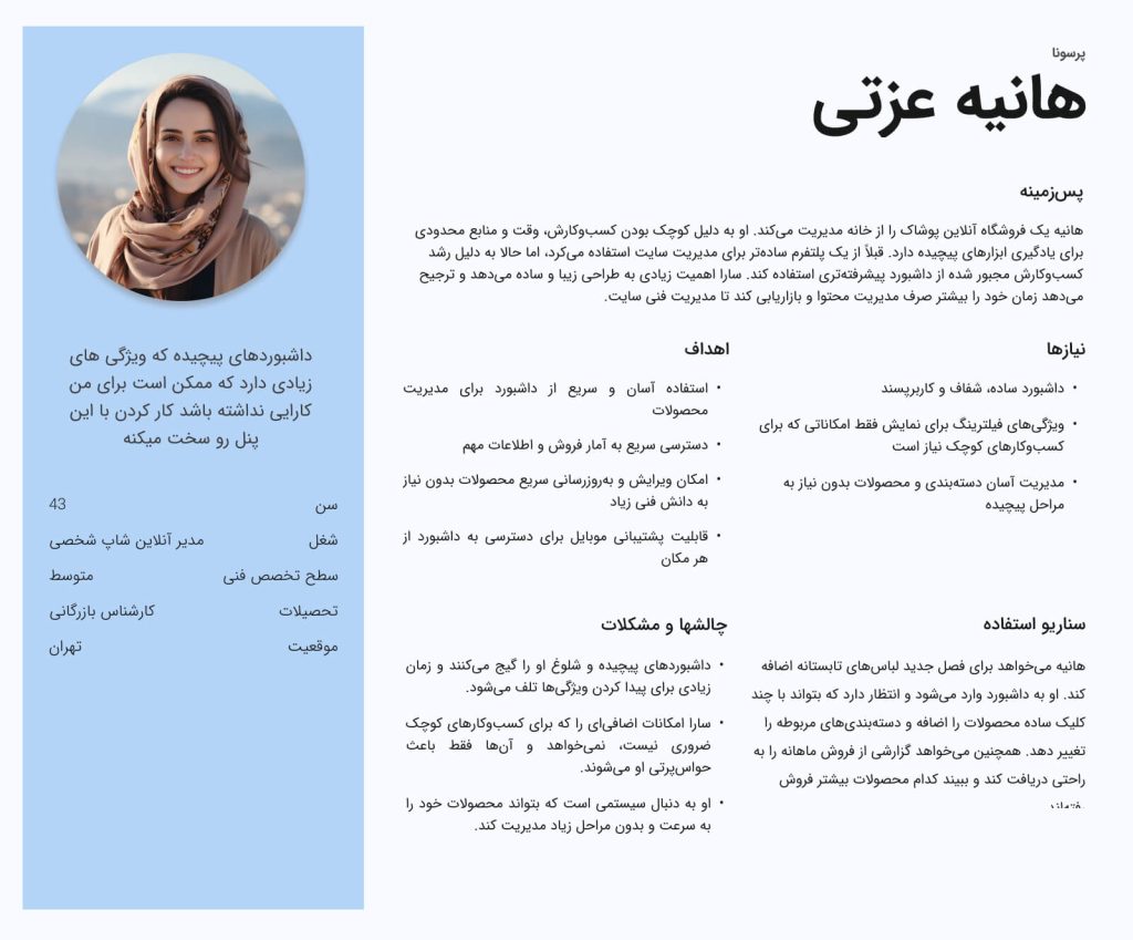
Pain Points
During the research conducted, we identified several key challenges that need to be addressed to improve the dashboard’s performance. These challenges directly impact user satisfaction. By gaining a precise understanding of these issues, we obtained valuable insights into how to optimize existing processes.
Outdated Appearance and Lack of Visual Appeal: The dashboard design conveys a sense of being outdated and lacks modern attractiveness for users.
Excessive Complexity and Cluttered User Interface: Users become confused due to the overwhelming number of options and various elements, making the system difficult to use.
Difficulty Accessing Important Information: Key information is hard to find, and accessing different sections is time-consuming.
Unnecessary Features for Small Users: Many system features are unnecessary for small website users and only clutter the interface.
Poor Information Architecture: Improper categorization and illogical distribution of information make it challenging for users to access the data they need.
Inefficient Product Categorization: With a large number of products, the current categorization system becomes complicated and makes searching difficult.
Difficult Management of Product Lists: Users struggle with the current tools for managing and updating products, and the processes are time-consuming.
Visual Clutter and User Distraction: The large number of graphical elements and information on the screen causes clutter and distracts users’ attention.
Lack of Customization Based on User Needs: Users cannot adjust or customize the dashboard environment to suit their needs, as all features are displayed by default.
Complexity in Making Changes: Processes for making small changes to products or categories are extremely complex and time-consuming.
Absence of Smart Filters: Users face a lack of advanced search and filtering tools for managing products.
Poor User Experience: Interactions and workflows are challenging, and users encounter many issues without sufficient guidance.
Interference of Advanced Features with Simple Needs: Complex and specialized features confuse users with simpler needs, making it difficult for them to work with the dashboard.
Lack of Quick Management Tools: There are insufficient tools for bulk changes or simplifying management tasks.
Slow Page Loading Speed: The loading of pages and information in the dashboard is slow, impacting the user experience.
Incompatibility with Mobile Experience: The user interface is not well optimized for mobile devices, resulting in a poor mobile user experience.

Solutions
In the solution specification phase, we gathered various ideas and transformed them into functional, user-centered features. Each solution was carefully designed to directly address the challenges identified in the previous stages, ensuring that these solutions contribute to enhancing the dashboard’s performance. The solutions are as follows:
Old appearance and lack of visual appeal:
Solution: Redesign the dashboard using modern, minimalist design that incorporates flat design principles and contemporary typography.
Method Used: New design samples were tested using A/B testing methods and user surveys, selecting the best version.High complexity and cluttered user interface:
Solution: Simplify the user interface by prioritizing information. Only core features should be displayed, with advanced capabilities placed in other sections for easier access.
Method Used: Optimization was conducted through usability testing and creating various scenarios for users.Difficult access to important information:
Solution: Redesign the navigation system using a simple and optimized menu. The most important information should be placed in easily accessible sections at the beginning.
Method Used: Card sorting was used to understand how users categorize information.Unnecessary features for small users:
Solution: Add a customization option for the dashboard so users can activate only the features they need and hide others.
Method Used: Based on surveys and in-depth interviews with small users, their needs were assessed, and the dashboard was optimized.Poor information architecture:
Solution: Redesign the information architecture using logical and simple categories that allow users easy access to information.
Method Used: Task analysis was utilized to understand user needs and adjust the information structure.Inefficient product categorization:
Solution: Add filters and smart search tools to help users quickly find the products they want.
Method Used: The search and categorization system was optimized through user analysis and search capability testing.Difficult management of product lists:
Solution: Add bulk editing capabilities for products, such as multi-selection and simultaneous editing.
Method Used: Task analysis was used to identify product management needs, along with user interviews for improving management processes.Visual clutter and user distraction:
Solution: Remove unnecessary elements and utilize white space to reduce visual clutter and improve user focus.
Method Used: Eye-tracking tests and observing how users interact with the page aided in simplifying the design.Lack of customization based on user needs:
Solution: Provide customization options so users can configure specific tools and the overall dashboard view according to their needs.
Method Used: Semi-structured interviews and personalization testing were used to add necessary functionalities.Complexity in making changes:
Solution: Add a quick editing system for small changes and optimize various categories directly from the dashboard.
Method Used: Workflow analysis was employed for better understanding of complex flows, and a simpler editing system was designed.Lack of smart filters:
Solution: Create smart filters and advanced search capabilities for products that can be filtered by various features like inventory, price, etc.
Method Used: User behavior analysis when using filters helped enhance the search system.Poor user experience:
Solution: Improve user flow and simplify interactions using visual tools and detailed in-system guidance.
Method Used: Usability testing and observing user behavior while using the dashboard contributed to enhancing the user experience.Interference of advanced features with simple needs:
Solution: More clearly separate advanced tools and features from simpler options for users with basic needs.
Method Used: Using user-centered design methods, tools and features were adjusted based on different user needs.Lack of quick management tools:
Solution: Create quick management tools such as fast product addition or bulk changes with one click.
Method Used: Based on user interviews and direct observation of user performance in product management, the tools were optimized.Slow page loading speed:
Solution: Optimize the system code and use efficient technologies to increase page loading speed.
Method Used: Performance review tools and page load analysis were used to identify and resolve loading issues.Incompatibility with mobile experience:
Solution: Redesign the user interface for a better experience on mobile devices and make the dashboard responsive.
Method Used: Mobile-focused testing and observing user behavior on mobile devices were used to optimize the user experience.