

Savii, Financial Application
Savii Banking is an app designed specifically for teenagers to help them manage their finances while learning about money. The platform allows users to track spending, save money, and understand financial concepts in a simple, user-friendly way. By using Savii, teens can develop responsible financial habits, with a focus on budgeting, saving, and understanding the value of money.
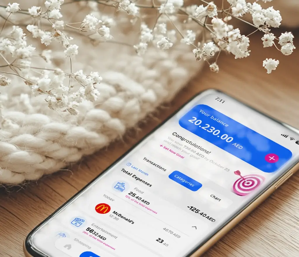
Presentation of the App
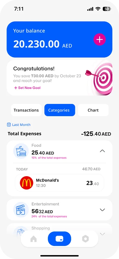
Key Features of the App
- Financial Education for Teens: The app educates teenagers on basic financial concepts like saving, budgeting, and spending responsibly.
- Real-time Expense Tracking: Users can monitor their expenses in real time, helping them stay within their budgets.
- Goal-based Saving: Allows teens to set saving goals, track their progress, and build savings for future needs.
- Simple Money Management: Features a straightforward interface for managing finances without complexity.
- No Fees or Minimum Balance: There are no fees or minimum balance requirements, making it accessible for all users.
My Role in tis Project
As Lead UX/UI Designer, I was responsible for:
Analyzing user behavior using Firebase and UX analytics
Conducting heatmap/session analysis with Hotjar
Designing and launching an in-app exit survey
Running structured in-person interviews
Hypothesis generation and A/B testing
Full UI redesign based on findings
Design Thinking Process
User Research
To better understand user behavior, we first analyzed the quantitative data from analytics tools.
Analytics via Firebase
1.Drop in Active Users
| Metric | Week 1 | Week 2 | Week 3 | Week 4 |
|---|---|---|---|---|
| Daily Active Users (DAU) | 3,600 | 2,100 | 890 | 430 |
| Avg Session Duration | 1m 12s | 58s | 43s | 35s |
| Screen Viewed Most Often | Home → Balance | Home only | Home only | – |
🧠 Insight: Users open the app, check balance, and leave. They are not interacting with savings or goal features.
2- Feature Abandonment
| Feature | Accessed | Completed |
|---|---|---|
| Set a Savings Goal | 2,300 | 410 |
| View Spending Chart | 1,800 | 1,030 |
| Financial Quiz Completed | 950 | 160 |
Hotjar Heatmap and Recording
We embedded Hotjar into the web dashboard and mirrored mobile interaction via WebView for testing.
1-Heatmap Summary (Mobile Dashboard)
| Section | Scroll Depth | Click Rate | Observation |
|---|---|---|---|
| Balance Card | 95% | 🔥 High | Users stop here |
| Savings Progress | 65% | Low | Ignored |
| Goal Setting Button | 55% | Very Low | Not seen |
Session Recording Examples:
#014: A user opened the app, scrolled twice, tapped balance, then left in 12 seconds
#021: Repeated taps on “Set Goal” but nothing happened due to slow load
#029: Opened “Spending Chart”, swiped left/right, but didn’t return again
🧠 Insight: Users hit dead ends or slow-loading features and leave.
Exit-Intent Survey (via Firebase Remote Config)
We triggered this survey after a user exited the app after <30s of usage.
Q1: What stopped you from using the app more?
“I just wanted to check my money” – 42%
“I didn’t understand what else I can do” – 29%
“The app was confusing” – 19%
“It was slow” – 10%
Q2: What would you like to see in the app?
“Show me my weekly spending” – 34%
“Saving goals that look cool” – 28%
“Daily challenges or tips” – 22%
“Leaderboard with friends” – 16%
🧠 Insight: App lacks clarity, excitement, and motivation.
In-Person Interviews
We interviewed 5 teens (ages 12–16) and 3 parents.
Teen Feedback:
“It just looks like my bank app, but boring.”
“I don’t get what I should do there.”
“I want something like levels, not just a number.”
Parent Feedback:
“I’d like to get a summary of where the money goes.”
“We need goals that teach them why to save.”
Key Problems Identified
| Problem | Evidence Source | Action Needed |
|---|---|---|
| No clear purpose or motivation | Firebase, Interviews | Gamified goals, daily tips |
| Key features not visible | Heatmap, Session Recording | Redesign layout hierarchy |
| No reason to return daily | Survey, Analytics | Daily dashboard, challenges |
| Parent oversight missing | Interviews | Add summary reports to parent app |
Solution: Redesign Based on Findings
Key Problems Identified
| Problem | Evidence Source | Action Needed |
|---|---|---|
| No clear purpose or motivation | Firebase, Interviews | Gamified goals, daily tips |
| Key features not visible | Heatmap, Session Recording | Redesign layout hierarchy |
| No reason to return daily | Survey, Analytics | Daily dashboard, challenges |
| Parent oversight missing | Interviews | Add summary reports to parent app |
Spending Breakdown Section
Pie Chart of spending categories
Tap any category to see purchase history by date
e.g. Tap “Food” → see “2025-03-12 – AED 30 – McDonald’s”
Filters by time (Today / Week / Month)
Goal Tracking Page
Each goal shows progress in % with an animated ring
“Add AED 5” CTA with feedback
Rewards: confetti + badges on completion
“Explore Goal Ideas” (curated suggestions)
A/B Testing (Using Firebase A/B)
We tested 2 dashboard versions:
| Version | Feature Summary | Result |
|---|---|---|
| A | Balance + 3 icons below | 42s avg. time, 14% click “Set Goal” |
| B | Balance + Spending Chart + Today’s Tip | 1m 35s avg. time, 41% click “Set Goal” ✅ |