

Redesigning the Store Management Dashboard
From Identifying At-Risk Customers to Building a Scalable Onboarding Experience
The redesign of the Store Management Dashboard evolved across three phases, with the goal of reducing customer churn and increasing effective product adoption.
In Phase 1, the primary focus was identifying the drivers of customer dissatisfaction and churn risk, enabling the team to identify at-risk customers early and define and track appropriate actions for each dissatisfaction factor.
In Phase 2, inadequate training and customers’ limited understanding of the product’s value and capabilities emerged as major sources of dissatisfaction. The focus therefore shifted toward improving the onboarding experience, reducing training-related support tickets, and increasing adoption of key product capabilities.
In Phase 3, as the business aimed to grow the number of stores from approximately 2,500 to 5,000, installation remained a key growth bottleneck. The project therefore expanded its focus to increasing installation capacity and reducing dependency on Support by improving and automating the installation process.
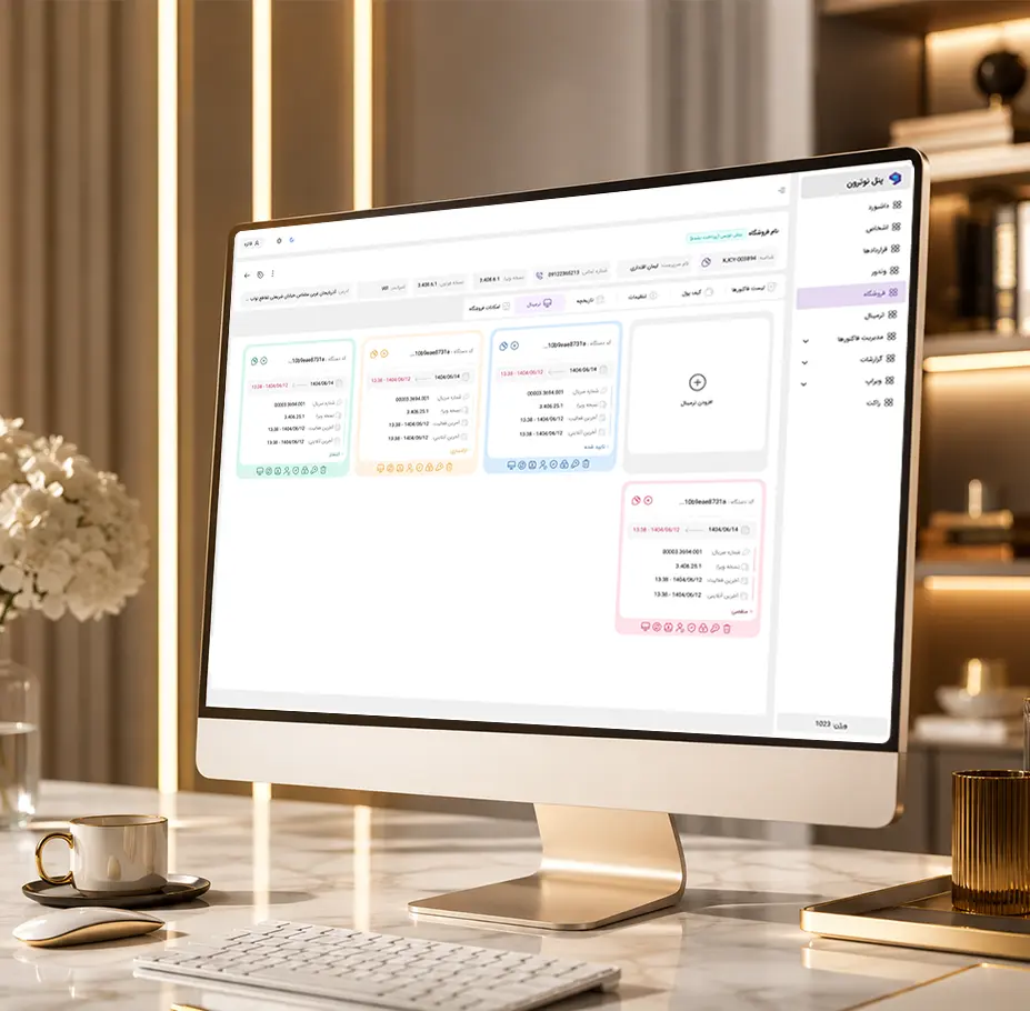
Project Journey: From Problem to Outcome
This project initially started as a retention problem, but as the business needs evolved, it expanded into a broader challenge:
How might we identify Customer Health earlier, reduce preventable Churn, and simultaneously make Support scalable enough to support the business’s multi-fold growth?
| Phase | Core Problem | Approach | Outcome |
|---|---|---|---|
| 01 — Identifying & Reducing Churn Risk | Churn was detected too late | Customer health monitoring, risk signals, and proactive intervention | Significant reduction in key risk signals and churn caused by technical issues |
| 02 — Increasing Product Adoption | Low product usage and training-related tickets | Improved onboarding, education, and self-service | Initial reduction in support tickets, but no sustained impact on adoption or churn |
| 03 — Scaling Support | Multi-fold growth without proportional headcount growth | Process redesign, prevention, automation, and self-service | Increased installation capacity and a shift toward an exception-based support model |
Phase 1 — Designing a Store Health Dashboard to Identify and Reduce Churn Risk
Initial Brief
Customers were typically identified only when their contracts were approaching renewal, while some had already abandoned the software months earlier. The challenge was to identify the root causes of dissatisfaction and Churn and detect at-risk customers before they became lost customers.
My Role
Analyzed Surveys, customer feedback, and product usage data to turn scattered signals of dissatisfaction into actionable insights
Identified and categorized the root causes of dissatisfaction and Churn, translating them into specific and solvable problems
Defined Metrics and Risk criteria for each factor to establish a shared framework for decision-making and prioritizing actions
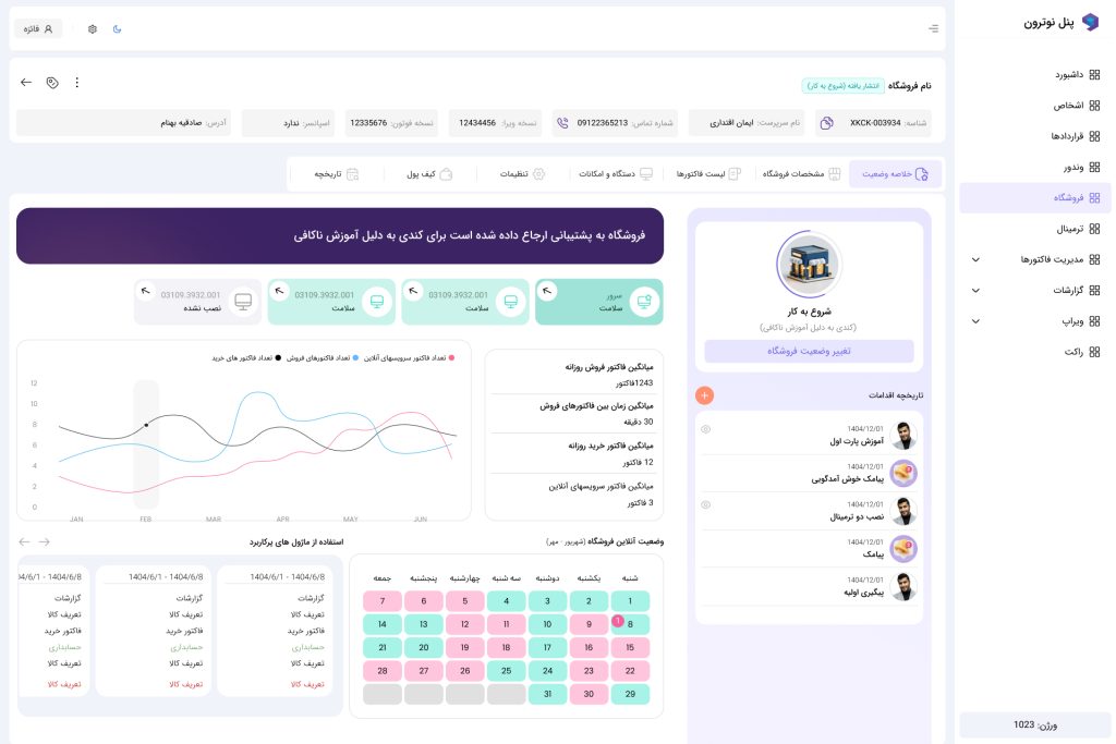
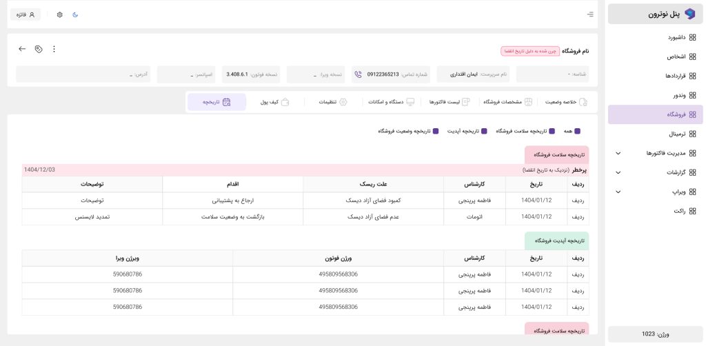
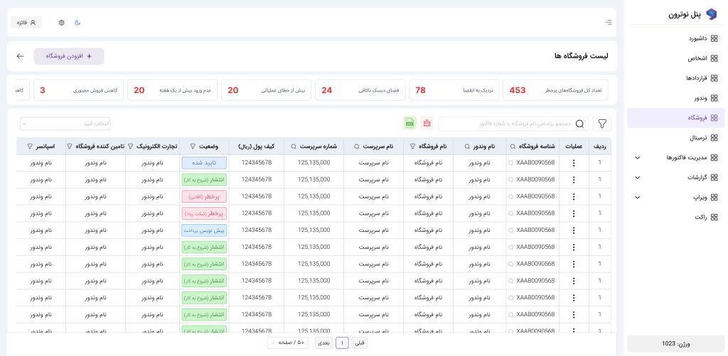
Designed a follow-up Workflow and Store Health Dashboard to help Product and CX teams identify risks early and take proactive action
Led the problem from discovery and analysis through solution design and outcome measurement, rather than focusing solely on the interface or visual output
Outcome
Key sources of dissatisfaction were translated into measurable indicators, enabling the team to identify and track stores at risk. As a result, the number of stores experiencing dissatisfaction across the identified risk factors decreased.
| Risk Indicator | Before Phase 1 | Two Months After Phase 1 |
|---|---|---|
| Monthly store Churn due to product quality | 14 | 5 |
| Stores with less than 5 GB of free space on Drive C | 168 | 14 |
| Stores with less than 2 GB of free database storage | 213 | 18 |
| Stores that had not logged into the application for more than one week | 78 | 45 (22 stores were recovered; the remaining cases were related to software changes) |
| Stores with average weekly sales below 50% of their previous 4-week average | 16 | 10 |
| Stores with average weekly online sales below 60% of their previous 4-week average | 7 | 5 |
To identify the risk of a store going offline, stores that were normally offline were excluded from the calculation. A risk was flagged only when the duration or frequency of offline periods in the current period increased significantly compared with that store’s own baseline over the previous 30 days.
Phase 2 — Improving Onboarding to Reduce Churn Caused by Low Perceived Product Value
New Need
One of the dissatisfaction factors identified in Phase 1 was inadequate training and customers’ limited understanding of the product’s value and capabilities. This led some customers to underuse key product features and subsequently become more at risk of Churn. As a result, the need to improve the Onboarding experience from the very beginning of the customer journey emerged.
My Role in This Phase
Reviewed the Onboarding process and identified friction points and Support dependencies to reduce installation time and increase time available for training
Analyzed product data, support tickets, and customer feedback to prioritize the main barriers to learning and activation
Simplified and redesigned installation steps, educational content, and post-installation communications
Improved Self-Service solutions and the Chatbot to reduce repetitive questions and dependency on Support
Identified Usability issues through ticket analysis and collaborated with Product and Engineering teams to address them
Defined and monitored metrics such as the number of training-related tickets during the first month, Onboarding completion, and adoption of key product capabilities
Outcome
The goal of this phase was to reduce the number of training-related support tickets during the first month after installation and increase adoption of key product capabilities.
We made modest progress in reducing training-related tickets and improving some Onboarding metrics. However, the goal of increasing broader Adoption and sustained usage of product capabilities was not achieved as expected.
Phase 3 — Designing an Installer & Installation Dashboard to Scale Support for Growth
New Business Need
As the business set a goal to grow from approximately 2,500 to 5,000 stores, the installation and setup process remained one of the key bottlenecks to growth. The new business need was therefore to increase installation capacity without creating a proportional increase in dependency on the Support team.
My Role in This Phase
Broke down the installation process into granular activities
Identified time requirements, dependencies, errors, and process bottlenecks
Translated findings into actionable solutions in collaboration with the Engineering team
Analyzed the pre-installation process and identified upstream bottlenecks, leading to the design of a Pre-installer and the separation of standard installations from problematic cases
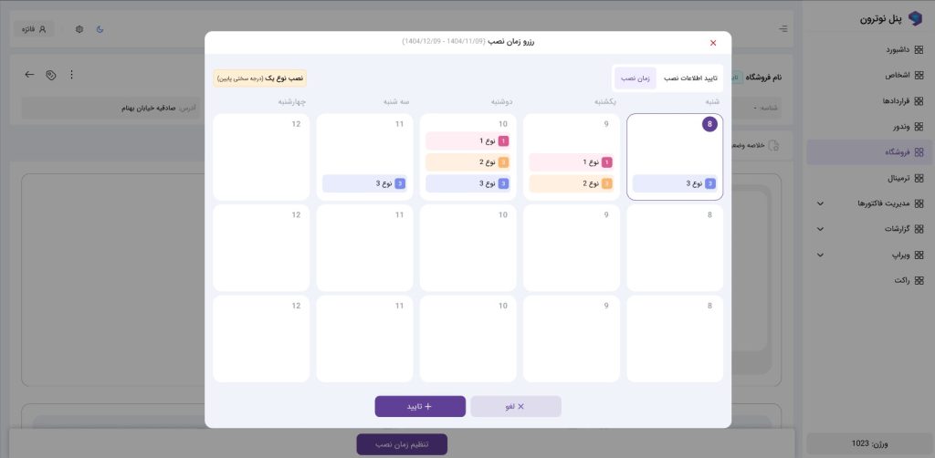
Designed an installation tracking dashboard and monitoring system for successful installations
Outcome
| Success Metric | Before Phase 3 | After Phase 3 |
|---|---|---|
| Successful installations per specialist per day | 3–4 | 8–9 |
Detailed Overview
Phase 1
The Problem I Inherited
The project started with a relatively simple but ambiguous problem:
Customer Churn was high, and we needed to understand a customer’s health before they were lost at renewal, while there was still an opportunity to win them back.
At the time, Churn was typically identified close to the contract renewal date through CX outreach, while many customers had already abandoned the product months earlier. As a result, the organization often discovered Churn when there was little opportunity left for intervention.
Interviews with lost customers and periodic Surveys had identified factors such as technical issues, product dissatisfaction, low perceived value, switching to competitors, and changes in the customer’s business. However, we did not yet know how these factors manifested in customer behavior before Churn.
So the core question became:
How can we identify changes in Customer Health before Churn based on customer behavior, product usage, technical status, and engagement—and turn these signals into actionable interventions for the CX team?
01 — I First Assessed the Current State and Data Constraints
My first step was not designing a UI or defining a Health Score.
I first investigated what we actually knew about customers today—and what we did not.
I spoke with Product, CX, and Data teams and mapped the existing Customer Lifecycle.
I clarified the underlying causes of performance issues, bugs, and crashes so they could later be measured and improved.
I categorized and clarified the types of dissatisfaction reported by the CX team.
At this stage, I found that the existing Data Infrastructure was primarily designed for management and operational reporting, rather than Customer Health Monitoring.
We also lacked a Customer Health Timeline that could answer a fundamental question:
“What has this customer’s health looked like over time, and when did they start drifting away from the product?”
This was an important finding because it showed that before designing the Dashboard, we first needed to determine which data signals were actually required to detect Customer Health.
02 — I Translated Churn Causes into Measurable Hypotheses
I did not treat the initial CX findings as definitive truths. Interviews and Surveys revealed reasons customers gave for Churn, but we still did not know how prevalent these factors were across the customer base or whether they were observable in customer behavior or data before Churn.
I therefore translated each potential cause into a hypothesis and defined specific metrics to investigate it.
Product Quality
Hypothesis: Technical issues such as slowness, freezes, errors, and crashes may increase the likelihood of Churn.
Metrics:
Free space on Drive C and the Database drive
Error Rate
Number of Crashes
Number of Freezes or Hangs
Downtime
Recurring errors per store
Product Adoption & Usage
Hypothesis: Declining product usage or reduced engagement with key capabilities may be an early signal that a customer is drifting away from the product.
Metrics for each store:
Last Active time
Number of active days within a defined period
Number of in-store sales invoices per day
Number of online sales invoices
Number of purchase invoices per day
Number of key Actions
Usage of core capabilities
Usage trends over time
Time gaps between customer activities
Product Value
Hypothesis: Some customers continue using the product but do not derive sufficient value from it—or do not understand the value of its capabilities.
Metrics:
Usage of capabilities that directly create value for customers
Frequency and volume of usage of key capabilities
Customer satisfaction or perceived-value scores from Surveys
Competitive Pressure
Hypothesis: Some customers leave the product because competitors offer stronger business advantages, such as Snapp’s online service or Yaran Daryan’s product-sourcing advantage.
Business Context
Hypothesis: Some Churn is independent of product quality and is instead driven by factors such as store closure, changes in the business model, or reduced business activity.
This categorization transformed the problem from a scattered list of customer complaints into a set of testable hypotheses and measurable signals.
It also allowed us to compare Usage with Business Activity to distinguish between declining software usage caused by product problems and declining usage caused by an actual reduction in the store’s business activity.
Before the Dashboard, I Validated the Signals
Rather than immediately building a Health Dashboard, I followed this workflow:
Data Requirements → Raw Data → Manual Monitoring → Intervention → Outcome
Suspected at-risk customers were manually investigated. This revealed that some of the identified risks were genuinely caused by issues such as:
Drive C running out of space
Incomplete Database installation
Outdated software versions
Broken Releases
Installation / Configuration issues
This validation ensured that the Dashboard was designed around a real Support workflow, rather than simply becoming a collection of charts and visualizations.
Designing the Dashboard for Reporting & Monitoring
The Dashboard was designed to answer four key questions:
WHO? → WHY? → WHAT NEXT?
| Level | Key Question |
|---|---|
| Management | What is the overall health of the Customer Base? |
| Risk | Which stores are at risk? |
| Diagnosis | What is causing the Risk? |
| Action | Which team should intervene? |
| Result | What happened after the intervention? |
Over time, Monitoring evolved beyond a Reporting Tool and also helped identify opportunities for Proactive Intervention and Automation.
Outcome
Technical Churn decreased significantly.
As a result, the next challenge was no longer simply about fixing technical problems. The focus shifted toward Adoption and Value Realization.
Phase 1
The Problem I Inherited
The project started with a relatively simple but ambiguous problem:
Customer Churn was high, and we needed to understand a customer’s health before they were lost at renewal, while there was still an opportunity to win them back.
At the time, Churn was typically identified close to the contract renewal date through CX outreach, while many customers had already abandoned the product months earlier. As a result, the organization often discovered Churn when there was little opportunity left for intervention.
Interviews with lost customers and periodic Surveys had identified factors such as technical issues, product dissatisfaction, low perceived value, switching to competitors, and changes in the customer’s business. However, we did not yet know how these factors manifested in customer behavior before Churn.
So the core question became:
How can we identify changes in Customer Health before Churn based on customer behavior, product usage, technical status, and engagement—and turn these signals into actionable interventions for the CX team?
01 — I First Assessed the Current State and Data Constraints
My first step was not designing a UI or defining a Health Score.
I first investigated what we actually knew about customers today—and what we did not.
I spoke with Product, CX, and Data teams and mapped the existing Customer Lifecycle.
I clarified the underlying causes of performance issues, bugs, and crashes so they could later be measured and improved.
I categorized and clarified the types of dissatisfaction reported by the CX team.
At this stage, I found that the existing Data Infrastructure was primarily designed for management and operational reporting, rather than Customer Health Monitoring.
We also lacked a Customer Health Timeline that could answer a fundamental question:
“What has this customer’s health looked like over time, and when did they start drifting away from the product?”
This was an important finding because it showed that before designing the Dashboard, we first needed to determine which data signals were actually required to detect Customer Health.
02 — I Translated Churn Causes into Measurable Hypotheses
I did not treat the initial CX findings as definitive truths. Interviews and Surveys revealed reasons customers gave for Churn, but we still did not know how prevalent these factors were across the customer base or whether they were observable in customer behavior or data before Churn.
I therefore translated each potential cause into a hypothesis and defined specific metrics to investigate it.
Product Quality
Hypothesis: Technical issues such as slowness, freezes, errors, and crashes may increase the likelihood of Churn.
Metrics:
Free space on Drive C and the Database drive
Error Rate
Number of Crashes
Number of Freezes or Hangs
Downtime
Recurring errors per store
Product Adoption & Usage
Hypothesis: Declining product usage or reduced engagement with key capabilities may be an early signal that a customer is drifting away from the product.
Metrics for each store:
Last Active time
Number of active days within a defined period
Number of in-store sales invoices per day
Number of online sales invoices
Number of purchase invoices per day
Number of key Actions
Usage of core capabilities
Usage trends over time
Time gaps between customer activities
Product Value
Hypothesis: Some customers continue using the product but do not derive sufficient value from it—or do not understand the value of its capabilities.
Metrics:
Usage of capabilities that directly create value for customers
Frequency and volume of usage of key capabilities
Customer satisfaction or perceived-value scores from Surveys
Competitive Pressure
Hypothesis: Some customers leave the product because competitors offer stronger business advantages, such as Snapp’s online service or Yaran Daryan’s product-sourcing advantage.
Business Context
Hypothesis: Some Churn is independent of product quality and is instead driven by factors such as store closure, changes in the business model, or reduced business activity.
This categorization transformed the problem from a scattered list of customer complaints into a set of testable hypotheses and measurable signals.
It also allowed us to compare Usage with Business Activity to distinguish between declining software usage caused by product problems and declining usage caused by an actual reduction in the store’s business activity.
Before the Dashboard, I Validated the Signals
Rather than immediately building a Health Dashboard, I followed this workflow:
Data Requirements → Raw Data → Manual Monitoring → Intervention → Outcome
Suspected at-risk customers were manually investigated. This revealed that some of the identified risks were genuinely caused by issues such as:
Drive C running out of space
Incomplete Database installation
Outdated software versions
Broken Releases
Installation / Configuration issues
This validation ensured that the Dashboard was designed around a real Support workflow, rather than simply becoming a collection of charts and visualizations.
Designing the Dashboard for Reporting & Monitoring
The Dashboard was designed to answer four key questions:
WHO? → WHY? → WHAT NEXT?
| Level | Key Question |
|---|---|
| Management | What is the overall health of the Customer Base? |
| Risk | Which stores are at risk? |
| Diagnosis | What is causing the Risk? |
| Action | Which team should intervene? |
| Result | What happened after the intervention? |
Over time, Monitoring evolved beyond a Reporting Tool and also helped identify opportunities for Proactive Intervention and Automation.
Outcome
Technical Churn decreased significantly.
As a result, the next challenge was no longer simply about fixing technical problems. The focus shifted toward Adoption and Value Realization.
Phase 2 — Improving Onboarding to Reduce Churn Caused by Low Perceived Product Value
Why Did This Phase Become Important?
In Phase 1, we moved the problem from the level of “ticket volume and churn” to Customer Health. By defining risk signals and analyzing customer behavior, we found that some customers entered a high-risk state very early after purchase—not necessarily because of a technical issue, but because they had not properly set up the product, were unfamiliar with its core capabilities, or had not yet experienced its value in their day-to-day work.
This raised an important question:
If customers fail to reach meaningful product usage during the first few weeks and months, can better education and more accessible content prevent Churn?
At that stage, our initial hypothesis was that a significant portion of training-related tickets and some Churn were caused by insufficient training. We therefore decided to design a focused intervention across Onboarding, Education, and Self-Service before making major product changes, and measure its impact.
Hypothesis
If customers, at the beginning of their journey:
can set up the product faster;
have a clear learning path;
have accessible content for core capabilities;
and do not need to contact Support to solve simple issues;
we should be able to:
Reduce the time it takes customers to reach meaningful product usage;
Reduce training-related support tickets;
Reduce dependency on Support;
Ultimately reduce Churn associated with low perceived value or low product usage.
For this reason, we did not view the solution simply as “creating a few videos.” Instead, we examined the entire customer journey from installation to learning and support.
What Did We Change?
01 — Simplifying Setup and Installation
At the beginning of the journey, both customers and Support spent significant time and effort on installation and system setup. We therefore simplified the installation process through an Installer, allowing customers to complete the initial steps with less dependency on technical staff.
However, during implementation, we realized that simplifying installation alone was not enough. A customer could successfully install the product and still not know where to start, which capabilities mattered most, or how to incorporate the product into their daily business workflow.
This shifted our focus from “successful installation” to “successful product adoption.”
02 — Designing Initial Training
We designed initial training for new customers to move learning away from scattered, expert-dependent explanations toward a more structured learning journey.
Instead of simply presenting a list of features, we focused the training on the tasks customers actually needed during their first days:
Getting familiar with the product environment
Performing basic actions
Setting up essential capabilities
Learning frequently used workflows
Understanding which business problems the product actually solves
This was an important distinction because we realized that teaching a feature is not the same as helping a customer reach value.
03 — Post-Onboarding Follow-Up
We did not limit training to the first session or first day. Follow-up and additional training were provided after customers started using the product to determine whether they had actually adopted it or had simply completed the installation and training process.
We distinguished between three different situations:
The customer has installed the product but is not using it;
The customer is using the product but is blocked by a specific capability;
The customer has not reached product value and does not yet understand why they should continue using it.
This distinction helped us understand that not every customer problem could be solved with generic educational content.
04 — Creating Educational Content for Different Capabilities
We created educational videos for frequently used capabilities and topics that generated the highest volume of questions. The goal was to allow customers to find relevant answers when needed instead of contacting Support for every simple question.
To make the content easier to consume and reduce dependence on live instruction:
Videos were kept short and topic-specific;
Separate content was created for specific capabilities;
Subtitles were added;
Content was placed closer to the points in the journey where customers were likely to need it.
05 — Clarifying Printer Setup
Printer setup was one of the areas where customers had significant dependency on Support. We moved this process away from ad-hoc verbal instructions toward a more structured flow, making it clear:
What prerequisites were required;
What the setup steps were;
What errors could occur at each stage;
Where to get help if something went wrong.
06 — Testing a Chatbot and Routing Customers to Relevant Content
We experimented with a Chatbot to explore the potential for automating customer support. The goal was not simply to answer questions, but to determine whether we could guide customers from their initial question to the right content, relevant training, or an appropriate troubleshooting path.
The experiment showed that simply introducing a new support channel was not enough. If customers could not get a reliable and relevant answer, they quickly returned to the familiar channel: contacting Support.
07 — Aligning Support and the Contact Center
To ensure that Self-Service was not limited to the product itself, Support and Contact Center teams were also trained to direct customers to relevant content during support interactions.
The goal was not to prevent customers from receiving help. Instead, we wanted to:
Resolve simple issues through appropriate content;
Prevent customers from entering a lengthy support process for minor questions;
Encourage customers to build the habit of using Self-Service resources.
Outcome
| Metric | Outcome |
|---|---|
| Training-related tickets during the first month | Initial decrease |
| Training-related tickets over 4–6 months | No significant sustained reduction |
| Churn caused by low perceived value or low usage | Almost unchanged |
| Usage of educational content | Occurred in some situations, but was not sustained |
| Self-Service adoption | Did not become a consistent customer habit |
At first glance, the initial reduction in training-related tickets could have been interpreted as a success. However, when we looked at a longer time horizon, we found that the reduction was not sustained.
Customers used the content when they first started, but when they encountered new problems, they continued to choose Support as their preferred channel.
This led us to move beyond metrics such as video views or short-term ticket reduction and ask a more important question:
Did customers actually change their behavior and become more independent after receiving the training?
Over the 4–6 month period, the answer was largely no.
Key Learning
The problem was not simply “customers were not trained.”
Training does not necessarily lead to product adoption, Self-Service, or perceived value.
A customer might watch a video, but that did not necessarily mean they would:
Use the capability in their daily workflow;
Find the answer independently the next time they encountered a problem;
Or better understand the value of the product.
We therefore identified an important distinction between:
Receiving Training ≠ Using a Capability ≠ Experiencing Product Value
This distinction changed how we analyzed the problem.
We realized that if customers still depended on Support to find capabilities, understand workflows, or solve simple problems, the issue was not necessarily a lack of content. It could also stem from:
Poor discoverability of capabilities;
Complex workflows;
Unclear copy and guidance;
A gap between educational content and real customer scenarios;
Or low perceived product value.
As a result, instead of simply producing more content, we began looking at the problem at the product experience level:
If customers need continuous training to use the product, perhaps part of the problem should be solved within the product itself—not through more educational content.
Connection to the Next Phase
This phase produced two important insights for the next stage.
First, we learned that reducing Support pressure cannot be achieved through more training alone. Processes need to be designed so customers can identify and resolve more issues independently.
Second, we realized that not all customers and not all Churn cases have equal value. Some customers would not be retained even with more training and follow-up because they lacked sufficient economic value or product fit. Therefore, preventing every instance of Churn was neither realistic nor necessarily the right business decision.
The focus therefore shifted from:
Preventing all Churn through more training and follow-up
to:
Identifying valuable customers, preventing their Churn, and designing a scalable Support model.
This became the bridge to the next phase. Instead of asking only “How can we help the customer?”, we began asking:
Which problems should be solved through education, which should be eliminated through product design, which can be automated, and which customers are actually worth intervening for?
This perspective led us to examine the broader Support ecosystem in the next phase—including installation, training, updates, renewals, and service activation—as one connected system.
03 — Preparing Support for Growth Without Proportional Headcount Increase
As the business strategy evolved, a new challenge emerged:
If the number of stores grows fourfold, does Support also need to grow fourfold?
Business Goal
| Metric | Status / Target |
|---|---|
| Number of stores | 1,867 → 5,500 |
| Growth target | ~4× |
| Maximum Support headcount growth | 2× |
| Approach | Eliminate · Prevent · Automate · Self-Service |
Analysis of Support processes showed that the bottlenecks were not limited to ticket volume:
Installation · Training · Updates · Renewals · Online Service Activation
Installation: From Simplifying the Installer to Redesigning the Entire Process
Initially, an Installer had been created to guide users through the installation process in a few simple steps.
But an important question emerged:
If the installation process has been simplified, why hasn’t installation capacity increased accordingly?
Current-State Analysis
I broke down the installation process into individual stages and analyzed where time was actually being consumed.
| Bottleneck | Impact |
|---|---|
| Coordinating with customers for remote access | Lost time |
| Downloading large files | Long waiting time |
| Windows and .NET issues | Installation failure |
| Insufficient disk space | Installation failure |
| Partitioning | Installation failure |
| Firewall configuration | Installation failure or interruption |
| Data migration | Variable duration |
| Post-installation configuration | Support dependency |
On average, installation took approximately 1.5 hours for ready systems and around 4 hours for problematic systems.
However, the issue was not only installation time. A significant portion of Support capacity was also spent on locating customers, coordination, troubleshooting, and routing each issue to the appropriate specialist.
Solution: Pre-Installation + Installation + Exception Management
Instead of simply making the Installer faster, we divided the process into multiple stages.
01 — System Readiness Check
Before installation started, the system was checked for:
Windows version;
Available disk space;
Partition status;
Required installation conditions.
02 — Installation Without Specialist Support
If the system was ready:
Download → Install → Activate
No remote access from a specialist was required.
03 — Problem Detection & Logging
If a problem occurred, the Installer identified the issue and reported it to Support.
For example:
Windows issue;
Insufficient disk space;
Partition issue;
Installation failure;
Unknown error.
In the initial version, users only saw an error message. In the new version, in addition to detecting and logging the issue, short instructional videos were embedded directly on the relevant screen for selected errors.
From Showing Errors to Solving Problems
Some problems were not simply reported—the system could also resolve parts of them.
| Problem | Action |
|---|---|
| Insufficient disk space | Clear temporary storage and recheck |
| Firewall restriction | Modify required settings with customer confirmation |
| Partitioning issue | Display troubleshooting guidance |
| Windows issue | Detect and route to the relevant specialist |
| Unknown error | Log the issue and escalate to a technical specialist |
The flow therefore moved from:
Error → Contact Support
toward:
Detection → Guidance → Customer Resolution → Issue Logging → Escalation
Installation Process Management Dashboard
Once the major error types had been identified, we designed a Dashboard for managing the installation process.
The Support manager could see the status of all cases, while each specialist could view only the cases relevant to them.
| Issue Type | Owner |
|---|---|
| Windows issue | Windows specialist |
| Unknown error | Technical specialist |
| Customer follow-up | Contact Center / Tier-1 support |
| Standard installation | No specialist intervention |
This prevented every request from entering the same queue.
Issue Detection → Ownership Assignment → Follow-Up
Solving One Bottleneck Revealed the Next
One of the most important learnings from this stage was:
Simplifying one step does not necessarily increase the capacity of the entire process.
The previous Installer had simplified the installation process, but installation capacity had not increased as expected.
The process analysis revealed two major remaining bottlenecks:
Finding and coordinating with the customer;
Systems that were not ready before installation began.
The problem therefore shifted from “installing the software” to “making the system ready for installation.”
Reducing Dependency on Specialized Staff
For customers with ready systems, specialized Support staff were no longer required to participate in the installation process.
The new flow became:
Sales → SMS & Notification → Pre-Installation → Installation → Activation
Only problematic cases were routed to the specialist team.
Simple follow-ups were also handled by Tier-1 / Contact Center staff, allowing specialists to focus their time on more complex issues.
As a result, the role of Support shifted from:
Executing every installation step
to:
Managing and resolving exceptions
An Example of Data Analysis
During the installation process analysis, approximately 29% of installations fell into the problematic-installation category.
| Installation Type | Average Time |
|---|---|
| Ready system | ~1.5 hours |
| Problematic system | ~4 hours |
Therefore, the objective was not simply to reduce installation time. The primary goal was to identify problematic cases before they consumed specialist capacity.
Training: The Next Bottleneck
Ticket analysis showed that a significant portion of Support requests were educational in nature.
Instead of treating all of them the same way, we categorized requests based on the nature of the problem:
| Problem Type | Solution |
|---|---|
| Customer can solve independently | Video / In-product guidance |
| Can be resolved with a simple explanation | Contact Center |
| Customer understands the need but the workflow is complex | UX simplification |
| Problem is caused by the interface | Copy and guidance improvements |
| Requires specialist investigation | Support specialist |
| Cannot be prevented | Reduce resolution time |
This approach helped us identify that some issues previously classified as “Support tickets” were actually “Product problems.”
Overall Outcome
| Before | After / Direction |
|---|---|
| Churn was identified around renewal | Customer health was monitored earlier |
| Lack of tickets was treated as a sign of health | Behavioral and technical signals were also monitored |
| Technical issues were largely handled reactively | Proactive detection and intervention were introduced |
| The Installer only simplified installation | System readiness was checked before installation |
| All errors were escalated to Support | Errors were detected and logged |
| All cases reached specialist staff | Standard cases were separated from exceptions |
| Training depended heavily on Support | Training, Self-Service, and Contact Center worked together |
| Business growth meant more pressure on Support | The Support model was redesigned for ~4× growth |