

Redesign of Novorio Studio
Novorio Studio, a digital design agency, aimed to establish a stronger online presence and attract more clients through its website. Given the nature of the business—offering website and app design services—the credibility and quality of its own digital experience played a key role in its success. The redesign project was initiated to improve conversion rates, strengthen brand perception, and enhance user interaction quality. This project served as an example of data-driven, user-centered design problem-solving.
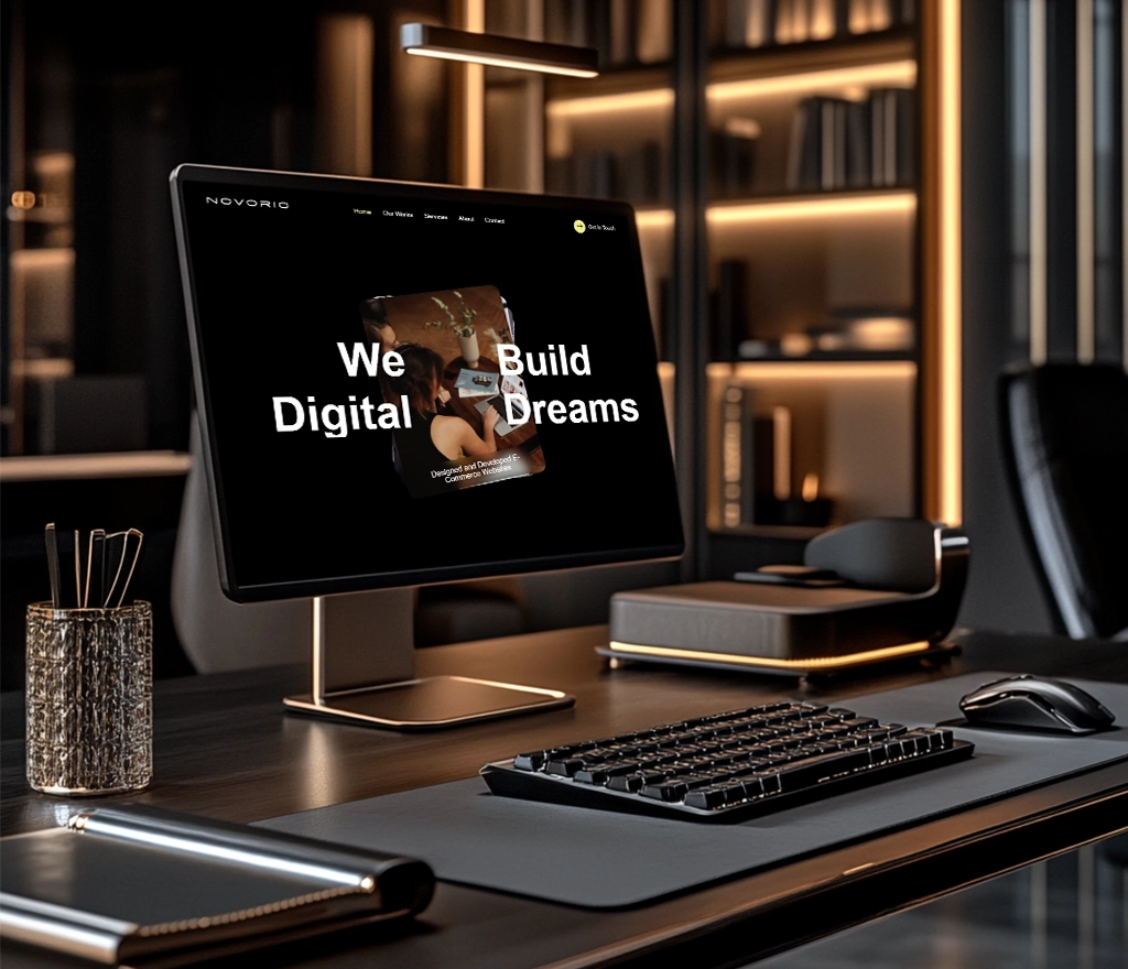
Presentation of the Site
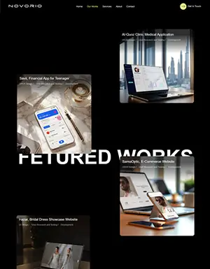
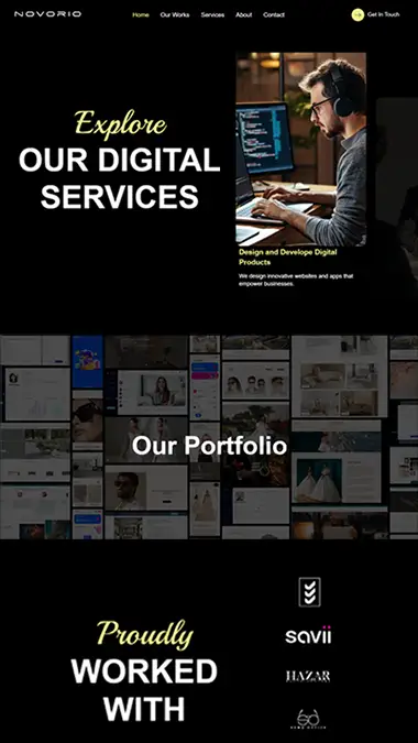
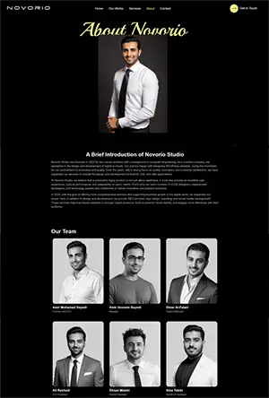
My Role in This Project
In this project, as the lead UX/UI designer, I was responsible for analyzing user behavior data, conducting user research, fully redesigning the user interface, and performing usability testing. My activities included quantitative analysis using Google Analytics, Microsoft Clarity, and Hotjar; designing and implementing exit surveys with Hotjar; formulating hypotheses; and conducting A/B tests to evaluate the performance of different versions. I also played an active role in coordinating between the development team and the project owner, aligning the design direction with business goals through regular sync meetings.
Problem Definition
Despite significant website traffic, users were leaving the site after visiting the homepage without any meaningful interaction. Data revealed a very low conversion rate and a high bounce rate. The main issue was that users perceived the website as unprofessional and lacking creativity—an especially critical problem for a company that offers digital design services. The site failed not only to establish initial trust but also to effectively communicate the brand’s value proposition. Our goal was to redefine and elevate this experience with a strong focus on user needs.
Design Thinking Process
Review of the Problem and Hypotheses
The Problem We Are Facing:
The current website of the web and app design company is unable to attract visitors effectively. As a result:
The site has low order registration.
Visitors are not converting into customers (low conversion).
Potential Issues We Can Consider:
A confusing or unattractive user interface.
Complex or unclear conversion paths.
Insufficient or unreliable content.
Slow load times or poor mobile experience.
Tone and voice not aligned with the target audience persona.
Weak CTAs (unclear or hidden call-to-action buttons).
User Research
To better understand user behavior, we first analyzed the quantitative data from analytics tools.
Google Analytics
1.Landing Page Analysis
| Page | Entrances | Bounce Rate | Avg. Session Duration | Short Analysis |
|---|---|---|---|---|
| /home | 940 | 72% | 00:38 | Many users leave without interaction after entering, indicating a weakness in initial attention-grabbing. |
| /services | 55 | 52% | 01:12 | Low visits and poor interaction, users are not interested in delving into service details. |
| /portfolio | 219 | 39% | 01:40 | Higher retention rate, showing that the portfolio is more engaging. |
2- Behavior Flow
| Starting Point | Common Paths | Drop-off | Behavior Analysis |
|---|---|---|---|
| /home | → /portfolio → /portfolio/item | /portfolio/item | Interest in the portfolio exists, but the homepage struggles with navigation. The user is confused. |
3-Goal and Conversion
| Defined Goal | Conversion Rate | Effective Paths | Low-Impact Pages |
|---|---|---|---|
| Consultation Request | 0.8% | /portfolio → contact | /home, /services |
4-. Device & Browser Performance
| Device Type | Bounce Rate | Avg. Duration | Potential Issue Analysis |
|---|---|---|---|
| Desktop | 70% | 00:45 | Weak interaction on the homepage |
| Mobile | 73% | 00:43 | No significant difference |
5-Acquisition Channels
| Channel | Users | Conversion Rate | Analysis |
|---|---|---|---|
| Ads | 576 | 0.6% | Most traffic comes from ads. |
| Direct | 203 | 1.4% | After ads, most traffic comes directly, with the highest interaction. |
| Referral | 96 | 0.8% | After direct users, referrals from other sites have the most interaction. |
Hotjar Analysis
1. Heatmap Summary
| Page | Click Areas | Full Scroll? | CTA Seen? | Interaction Analysis |
|---|---|---|---|---|
| /home | Portfolio section | 60% | Weak | Users mostly look for content, but the CTA is not attention-grabbing. |
| /services | Click at the bottom on icons | 50% | Not seen | The services section is not visible or engaging. |
| /portfolio | Portfolio images | 80%+ | Frequently clicked | High interaction, content matches user expectations. |
2. Session Recordings
| Video | User Behavior | Ambiguities | Improvement Opportunity |
|---|---|---|---|
| #001 | Excessive scrolling on the homepage and confusion, dead click in portfolio section | Faint CTA, unclear text | Strengthen visual guidance and call-to-action |
| #012 | Viewed a few portfolio items, then left the site | No CTA after successful interaction | Add CTA at the end of portfolio items |
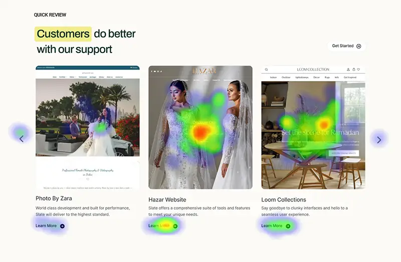
HeatMap of Our Portfolio Section in Previous Design
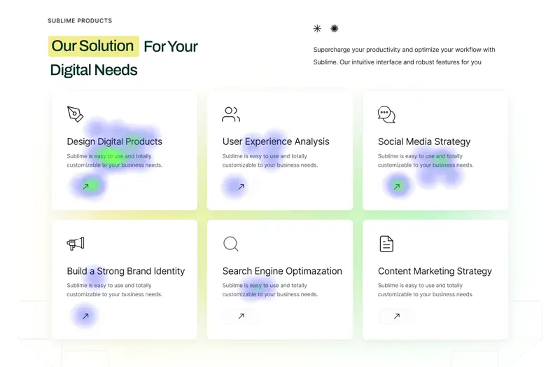
Traffic Acquisition in Google Analytics in Previous Design
Hotjar Survey
We used Hotjar to display an exit-intent survey form before users leave the site. We included these two questions to understand why users are not interacting much with the site and why they leave the page so quickly:
- What prevented you from booking a consultation right now?
- I planned to come back later.
- The website was not Proffesional.
- The portfolio was not appealing.
- I needed more information.
- What frustrated you the most on this website?
- The website was slow.
- The navigation was confusing.
- I couldn’t find what I was looking for.
- The design was unprofessional.
- The content wasn’t helpful.
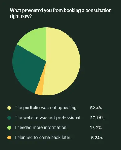
Results of First Question
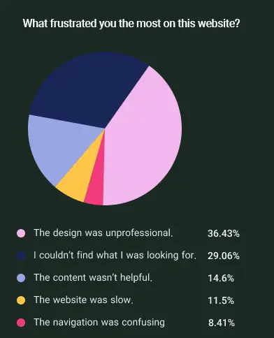
Result of Second Question
In-person Interview Conducted
After conducting the in-person interview, we arrived at the following conclusions:
Main Problem:
The website visually does not convey the image of a professional web design company.
The portfolio and service content lack appeal and innovation, making them feel dull.
Users are looking for bold, trendy, and unique designs, which this website does not offer.
Final Recommendation:
A redesign of the brand and website UI is necessary with an emphasis on the following:
A more professional and distinctive visual identity.
A stronger presentation of the portfolio with rich UI and high variety.
Service offerings presented through storytelling with a clear value proposition.
Competitor Analysis
Features Digital Gravity DBW Element 8 Visual Design Use of scroll animations and interactive videos to showcase portfolio Creative typography and large fonts to attract attention Professional design with scroll animations and 3D characters User Experience (UX) Simple and smooth navigation, focusing on introducing services and portfolio Organized structure with focus on typography and content delivery Strong user experience with engaging and interactive animations Brand Showcase Display of logos and projects of reputable brands on the homepage Focus on design and typography without showcasing specific brands Display of collaborated brands on the homepage to build trust Performance & Speed Good performance with optimized animations High loading speed with a light and minimal design Slow loading due to heavy animations and 3D characters Free Consultation Good guidance on the availability of free consultation, with a consultation request button in the menu Consultation via contact form Free consultation offered before order placement
Problem Statement
Problem Formulation from the User’s Perspective:
“How can we design the agency’s website to convey professionalism, creativity, and trust, encouraging more users to contact or submit a consultation request?”
Value Proposition / UX Goals
Based on the findings, here’s the translation:
What We Need to Convey:
A professional and bold brand
Creative and up-to-date design
Diverse and eye-catching portfolio
Clear and prominent CTAs on every page
UX KPIs
| KPI | Current Status | Goal |
|---|---|---|
| Bounce Rate | 72% | Reduce to 45% |
| Form Conversion Rate | 0.8% | Increase to 3%+ |
| Scroll Depth | Average up to 60% | Increase to 85% on key pages |
| Time on Portfolio Page | 1m:10s | Increase to 2m+ |
Idea Documentation
| Website Section | Problem | Proposed Idea |
|---|---|---|
| Home Page | Simple and basic feel | Design a Hero section with subtle animation + bold typography + portfolio slideshow |
| Services Section | Services not understood | Design interactive cards with icons + names + simple microcopy |
| CTAs | Ignored | Fixed CTA in the sidebar or bottom of the page + soft entrance animation |
Redesign the Website
After conducting our analysis, we concluded that the presentation of portfolio items is the most crucial aspect of the website redesign. Displaying only a single image from the homepage of designed websites was not engaging enough for users.
Additionally, the design of Novorio’s website, particularly the homepage, was overly simplistic. The choice of colors and other design elements made the website appear unprofessional. Moreover, the “Request a Consultation” button was not compelling and failed to attract users.
The Services section also did not effectively capture users’ attention. To improve the user experience and increase engagement, we have implemented the following solutions:
- Redesigning the website based on modern trends
- Using a dark color scheme to convey professionalism and elegance
- Incorporating animations in the Services and Portfolio sections to enhance engagement
- Displaying more portfolio items on the homepage
- Adding an eye-catching animation to the “Request a Consultation” section to capture users’ attention
- Providing additional information about the free consultation offer to encourage user action
Animation of Our Services
Animation of Hero Section to introduce our Works
Animation of Our Services
A/B Testing By Google Optimazation
- In the end, considering that the portfolio section wasn’t providing an optimal user experience for many users, we decided to redesign it in a way that more portfolio items would be visible on the first page and at the first glance. The goal was to allow users to easily see more portfolio pieces without the need to scroll. To achieve this, we designed the first version. However, the issue with this design was that, due to the lack of titles or descriptions for each item, users might feel disappointed again and fail to connect well with the content. Therefore, to resolve this, we designed a second version that included brief descriptions for each portfolio item. Finally, to evaluate the performance of both designs, we used Google Optimize to run an A/B test and determine which design had a lower Bounce Rate and higher Session Time. Ultimately, the first design, which featured more portfolio items on the first page, was approved.
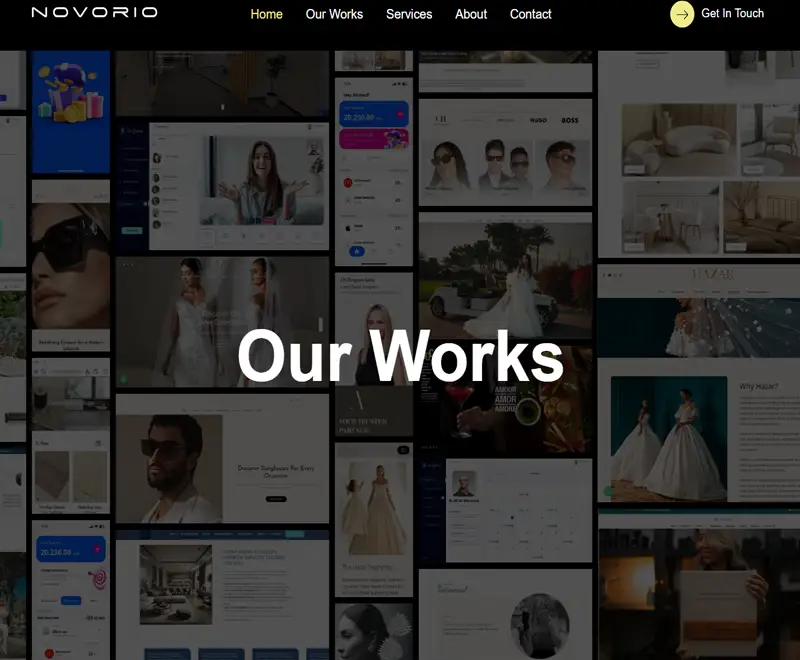
Portfolio Section (Design 1)
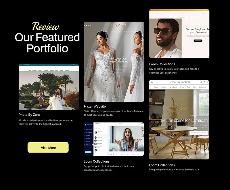
Portfolio Section (Design 2)
Conclusion
| KPI | Current Status | Goal | Results |
|---|---|---|---|
| Bounce Rate | 72% | Reduce to 45% | Reduce to 41% |
| Form Conversion Rate | 0.8% | Increase to 3%+ | Increase to 1.9%+ |
| Scroll Depth | Average up to 60% | Increase to 85% on key pages | Increase to 91% on key pages |
| Time on Portfolio Page | 1m:10s | Increase to 2m+ | Increase to 1m:40s |