

My Expertise in Scalable Design Systems
Creating a scalable design system is essential for maintaining consistency and efficiency in large and evolving design projects. I have a deep understanding of how to build design systems that not only fit the immediate needs of a product but also scale seamlessly as teams, features, and products grow. Here’s a breakdown of the key components I use to create scalable and sustainable design systems:
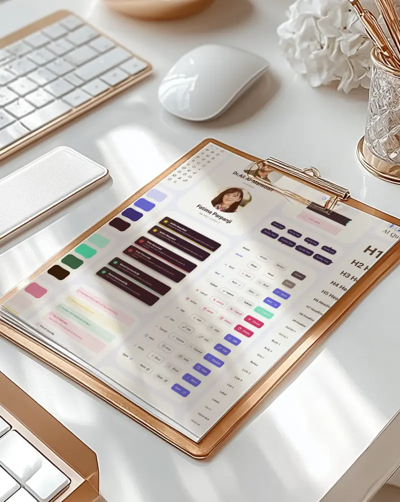
Variables
What They Are:
Variables in design systems are reusable, dynamic values that allow for flexibility and consistency across designs. These can be applied to colors, typography, spacing, and other design properties.
How I Use Them:
- I define global variables for core aspects like primary and secondary colors, font sizes, spacing, and breakpoints.
- By storing these values as variables in tools like Figma and Sketch, I can quickly make adjustments across all design files without the need to update each element manually.
- This ensures consistency, and any changes to brand guidelines can be applied globally, making the design system more agile and scalable.
Design Tokens
What They Are:
Design tokens are a way of abstracting design decisions (like colors, typography, spacing) into a format that can be used by both design and development teams. They act as the atomic building blocks of a design system.
How I Use Them:
- I implement design tokens in Figma and code repositories to ensure seamless handoff between design and development.
- These tokens are stored in a structured format (JSON or YAML) so that developers can easily apply them to the app, reducing inconsistencies.
- I also ensure that these tokens can be easily updated, enabling quick iterations in the design process while keeping the UI consistent.
Variants
What They Are:
Variants are different states of a component that can be switched based on interactions, like button states (hover, active, disabled), form fields (focused, error, normal), etc.
How I Use Them:
- I define component variants for common UI elements, such as buttons, cards, and input fields, directly within Figma.
- Using Figma’s Variants feature, I group different states of a component under one parent component, making it easy to maintain and switch between various states.
- This makes it easier to manage component-based design, especially when scaling across larger projects with multiple states or interactions.
Components
What They Are:
Component sets are collections of reusable UI elements that are grouped together to promote consistency and reduce repetitive design work.
How I Use Them:
- I create comprehensive component libraries that include buttons, input fields, navigation menus, icons, and cards.
- Each component in the set is designed for flexibility and reusability, ensuring that they can be adapted for different use cases.
- These components are maintained in a shared library and are versioned for future scalability, ensuring the system grows organically as new components are needed.
Auto Layout
What It Is:
Auto Layout is a Figma feature that allows UI components to automatically adjust and align based on the content or container size.
How I Use It:
- I use Auto Layout extensively for creating responsive and flexible designs.
- It allows me to create components that adapt to different screen sizes (desktop, tablet, mobile) and dynamic content without manually tweaking the layout.
- This approach is key when building scalable design systems because it ensures the design works across multiple breakpoints and devices.
Interactive Components
What They Are:
Interactive components are elements that change their state in response to user interactions, such as hover effects, clicks, or drag-and-drop actions.
How I Use Them:
- I use interactive components in Figma to create realistic prototypes and to test interactions before moving to development.
- Components like buttons, toggles, and input fields are made interactive with built-in hover states, transitions, and feedback.
- This helps in creating a more user-friendly experience, ensuring that components not only look good but function smoothly in real-world applications.
Boolean Properties
What They Are:
Boolean properties define whether a component has a particular state (e.g., active or inactive, visible or hidden).
How I Use Them:
- I apply Boolean properties to components to define toggles, like whether a button has an icon or a text label, or whether a modal is visible.
- This allows me to create more dynamic components that can adjust their state easily and respond to different conditions in the UI.
Instance Swap
What It Is:
Instance swap is the ability to change one component instance with another, without affecting other instances that might be linked to the original.
How I Use It:
- I use instance swap to allow for rapid updates and customization of components without breaking the consistency of the design system.
- For example, if a button design is reused throughout the system, I can swap the button’s label or icon without altering its overall structure, saving time and keeping the system consistent.
Design Libraries
What They Are:
Design libraries are shared files that contain all the components, styles, and patterns used across a product. They allow multiple designers to work collaboratively while ensuring consistency.
How I Use Them:
- I set up shared design libraries in Figma for all teams to access, ensuring that components are used correctly and consistently across different projects.
- These libraries are version-controlled, allowing for easy updates and the ability to track changes to the design system over time.
- I also ensure that the libraries are modular, with different sections for typography, colors, components, and patterns, so they can be updated independently as the product evolves.
Conclusion
Designing a scalable design system requires a deep understanding of flexibility, modularity, and future-proofing. By utilizing tools like variables, design tokens, and components, and following best practices like auto-layout and interactive components, I build systems that can grow and adapt seamlessly. This ensures consistency across large teams and projects, while also keeping design work efficient, organized, and responsive to changing needs.